TerraGo Analytics
TerraGo Analytics provides clients with an intuitive way to visualize their data through customizable graphs and tables, making it easier to track assets and manage operations using Tableau, tailored to each business's specific needs.
In my role as UI/UX Design Lead, I conducted data analysis, led the design of a new layout, advanced data visualizations, and UI enhancements, and established a foundation for consistent design templates.
ROLE
UI/UX Design Lead
TEAM
Chip Hathaway, VP Product
Vish Subramanian, Software Development Manager
Noreen Nugent, Tableau Developer
John Suh, Director of Technical Program Management
Dave Reiff, Sr. Director of Services
Ben Chadbourne, Sr. Director of Services
Gaetano Assetta, Sr. Project Manager
Anna Kontorskiy, Technical Project Manager
Tim Jensen, Technical Project Manager
TIMELINE
Aug 2024 - 2025 Mar
PLATFORMS
Web
Project Goal
Please Inlcude Project Goal briefly
Lorem Lipsum Lorem LipsumLorem LipsumLorem LipsumLorem LipsumLorem LipsumLorem Lipsum
Process
The design process involved working closely with the team to improve the structure, accessibility, and presentation of data. Different strategies were explored to enhance clarity and usability, with the design refined through continuous feedback to ensure it met project goals.
Design Process Breakdown
a. Collaborating with Project Managers and Analyzing Data
Met with project managers to analyze and understand the data. Categorized, grouped, and ungrouped data while establishing a clear hierarchy based on its importance.
b. Restructuring Navigation and Information Architecture
Redesigned the navigation system and reorganized the information architecture to improve accessibility and clarity.
c. Exploring and Implementing Data Visualizations
Researched and selected appropriate graph and table types to best represent the data.
d. Final Review and Validation
Conducted a comprehensive design and structure review with project managers and Tableau analysts to ensure accuracy and usability.
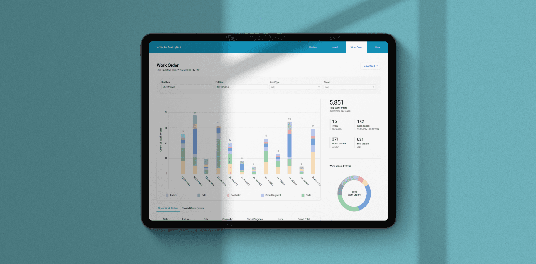
Design Overview
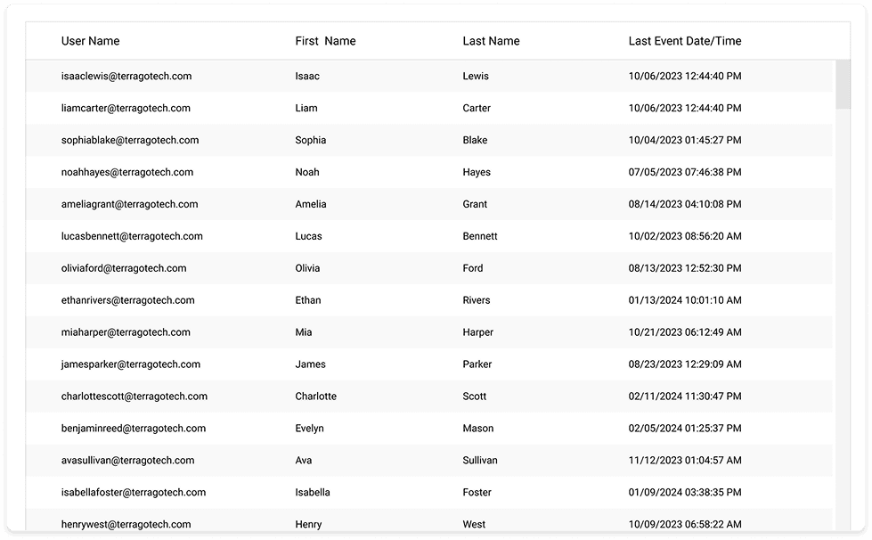
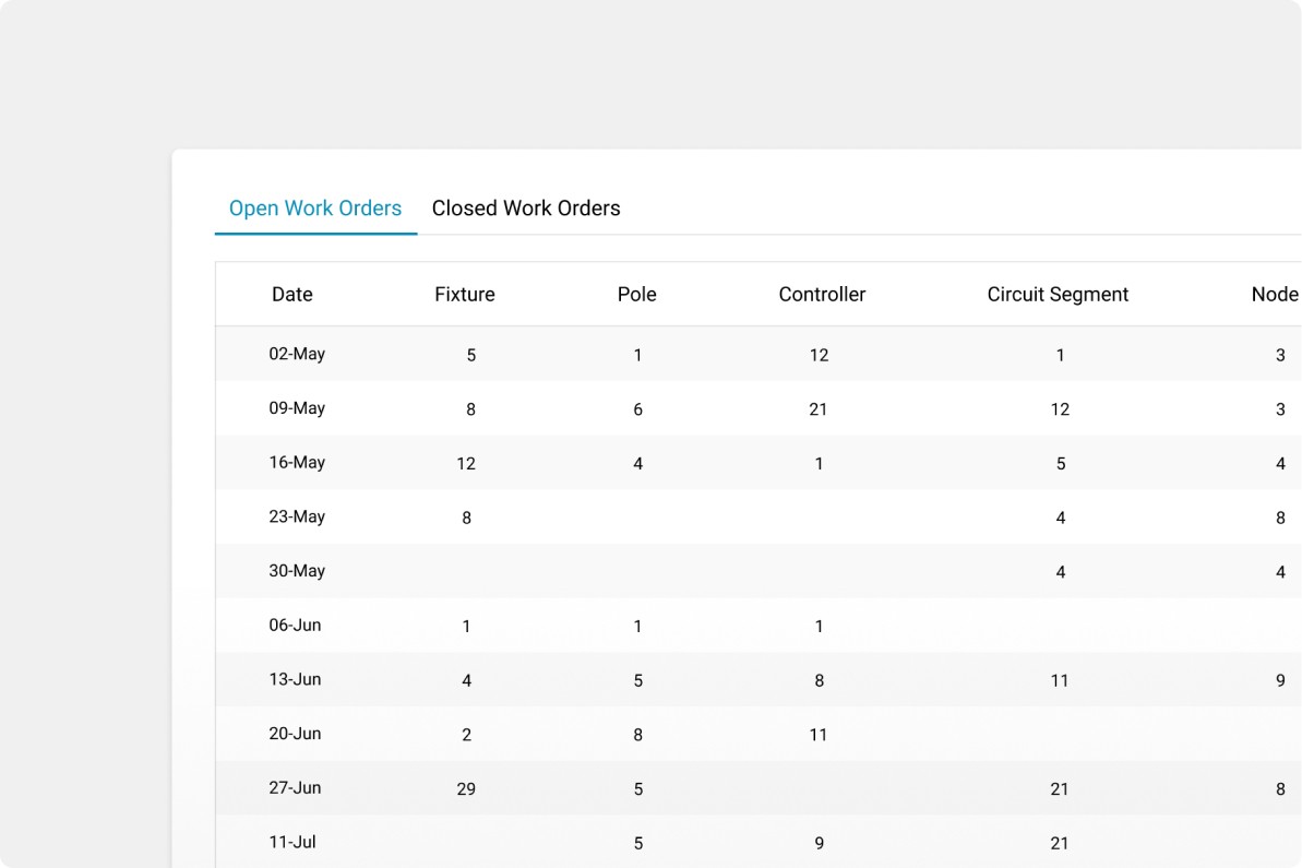
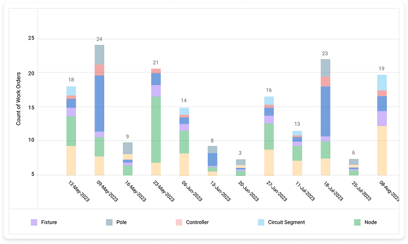
The design focuses heavily on data visualization, ensuring that users can view information from a top-level overview down to more detailed data in a way that suits their preferences. Visual elements are consistently used to display data without overwhelming users, making it easier to digest information throughout the page. Tabs are utilized to separate content, rather than listing all tables, graphs, and data together. Additionally, a side column is created to highlight or emphasize other types of data effectively.
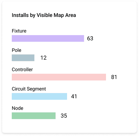
Chart and Maps to Highlight Key Data
There will always be a prominent top-level visualization, such as a map or graph, to draw users' attention as it represents the most important data. This visualization should be visually appealing, using effective graphic design and color schemes to enhance clarity and engagement.

Key Numbers at a Glance
The design highlights total numbers, rates, or key metrics to help users quickly identify important data. Information is presented clearly through various types of data, such as dates, rates, or counts, enabling users to grasp key insights at a glance without overwhelming details.

Visualizing Additional Information Clearly
When presenting additional data, different forms of visualizations, such as graphs or pie charts, are used. This information is placed in a side column, allowing users to view and explore extra details by section.