TerraGo Technologies introduced a new interface for its streetlight management app, designed to create a user-friendly experience that enhances usability and improves navigation for field crews.
As the UI/UX Design Lead, I conducted the design process by identifying user pain points, creating intuitive designs, and leading collaboration across teams to deliver seamless, user-centered solutions.
ROLE
UI/UX Design Lead
TEAM
Chip Hathaway, VP Product
Jon Willis, Director of Product Development
Kyle Goranson, Senior Software Developer
Mark Walsh, Full-Stack Developer
Sunil Karthick, Software Developer
Ramachandran, Software Developer
Fred Wolke, Lead Software QA
TIMELINE
Apr 2023 - Dec 2023
PLATFORMS
iOS, Android
Project Goal
The primary objective of this project was to transform the Gen 5 application into a more user-friendly and map-centric interface, making asset data more accessible and revolutionizing asset management. By simplifying navigation and reducing information overload, the goal was to enhance the efficiency and intuitiveness of the application, enabling field crews to manage assets with ease.
Slide left or right to compare
Process
Research
Gathered feedback from Project Managers through meetings and calls, focusing on key areas like the user interface, features, workflows, performance, and bugs. Additionally, attended customer training sessions to observe how field crews interacted with the app, gaining valuable insights into their behavior and challenges.
Insights Analysis
A Clear and Simple Menu/Navigation
27.6% of users prioritize an easy-to-understand and uncluttered navigation system to reduce complexity.
Enhanced Visual Progress Indicators
20.7% of users require clearer visual cues to track their progress and interaction status effectively.
Concise Information Delivery
15.5% of users value simplified and streamlined information to avoid visual clutter.
Streamlined Workflows
13.8% of users seek efficient and well-defined workflows to improve task completion.
Design Flow
Focused on enhancing the app’s user experience by simplifying navigation, improving usability, and ensuring smooth implementation. This involved restructuring the app’s framework, conceptualizing initial design layouts, and finalizing detailed visual designs. Close collaboration with teams ensured alignment with user needs and company goals throughout each phase.
Design Overview
The design overhaul focuses on improving user experience by enhancing map-based navigation and optimizing asset management. By streamlining interactions and refining the layout, the changes make it easier for users to manage and review their assets efficiently. These updates contribute to a smoother, more intuitive interface, improving both task flow and data accessibility.
Provide a map-based interface for clearer and more efficient asset data display.
Simplify task and screen transitions by minimizing unnecessary steps.
Organize essential data to reduce information clutter on screens.
Introduce checkboxes for record selection and status banners for device status
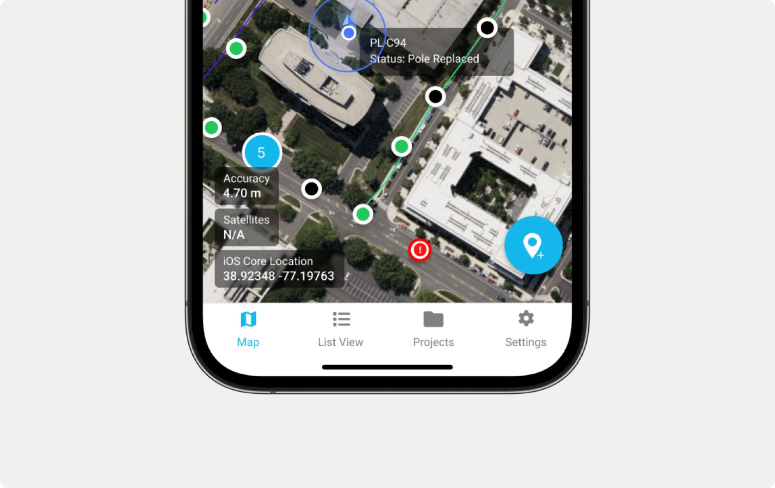
Map-Centric Design
Transforming the interface into a map-centric design makes asset data more accessible on mobile. By increasing the map size by 35%, users can view more records at once, including key asset statuses like "installed" or "repaired." This makes it easier to manage multiple assets, reducing the need for excessive zooming or panning, and streamlining navigation for more efficient asset management.
Map View
Default stacked view with the map on top and an expandable data table below.
Map Card Open
New side-by-side view for map records and the data table.
Streamlined Navigation
The streamlined navigation menu simplifies task and screen transitions by reducing unnecessary steps. By grouping menu buttons or organizing them more clearly, users experience less clutter and confusion. This smooths the flow between menus and the main screen, allowing users to complete tasks faster with fewer taps and a more efficient experience.
Bottom Navigation Bar
Introduced a new bottom navigation bar with "Map," "List," "Project," and "Settings" for users to quickly switch between menus/pages.
Floating Action Button(FAB) Menu Screen
The new FAB menu screen lets users access additional action buttons with search filter options, addressing the need for more buttons on the main screen.
Settings
Introduced a settings page with two sections: "General" for app/system info and "Map Display" for adjusting map settings.
User-Centric Data Organization
By displaying multiple items on a single page and simplifying the data, users can quickly review and search for assets. This boosts efficiency, reducing the time spent scrolling or searching for specific information, ultimately enhancing usability and streamlining asset management.
List View Displaying Alon
Default stacked view with the map on top and an expandable data table below.
Show More Cards
New side-by-side view for map records and the data table.
Clear Visual Indicators
Clear status updates and action prompts inform users when a project download is available or when there is no signal. This keeps users aware of important conditions, minimizes confusion, and helps users stay on track with their tasks.
Project Download Banner
Display a project download banner to allow users to download the latest project records and ensure they have the most up-to-date data and track records.
Device Offline Banner
Display an offline banner to notify users that the device is not online, indicating a lack of signal in the area. This informs users that their outdoor work may not upload and could be pending on the server.
Outcome & Conclusion
The redesigned Streetlight App version 5.6.0 has been successfully released and delivered to over 20 utility clients, including Duke Energy, NES Commercial, Nextra, and PHI. The transition went smoothly, improving efficiency for field crews and enhancing client operations. For TerraGo, these updates reduce support demands and streamline future product enhancements.
Impact and Results
72%
Training Expenses Reduction
Reflecting strong engagement with the updated system
96%
Initial User Adoption Rate
Reducing the time required to configure and manage data
25%
Task Completion Improvement
Accelerating the learning curve and enhancing efficiency.